Scrolls Made

Olivia Baker – Order of the Sapphire

IMGP5113

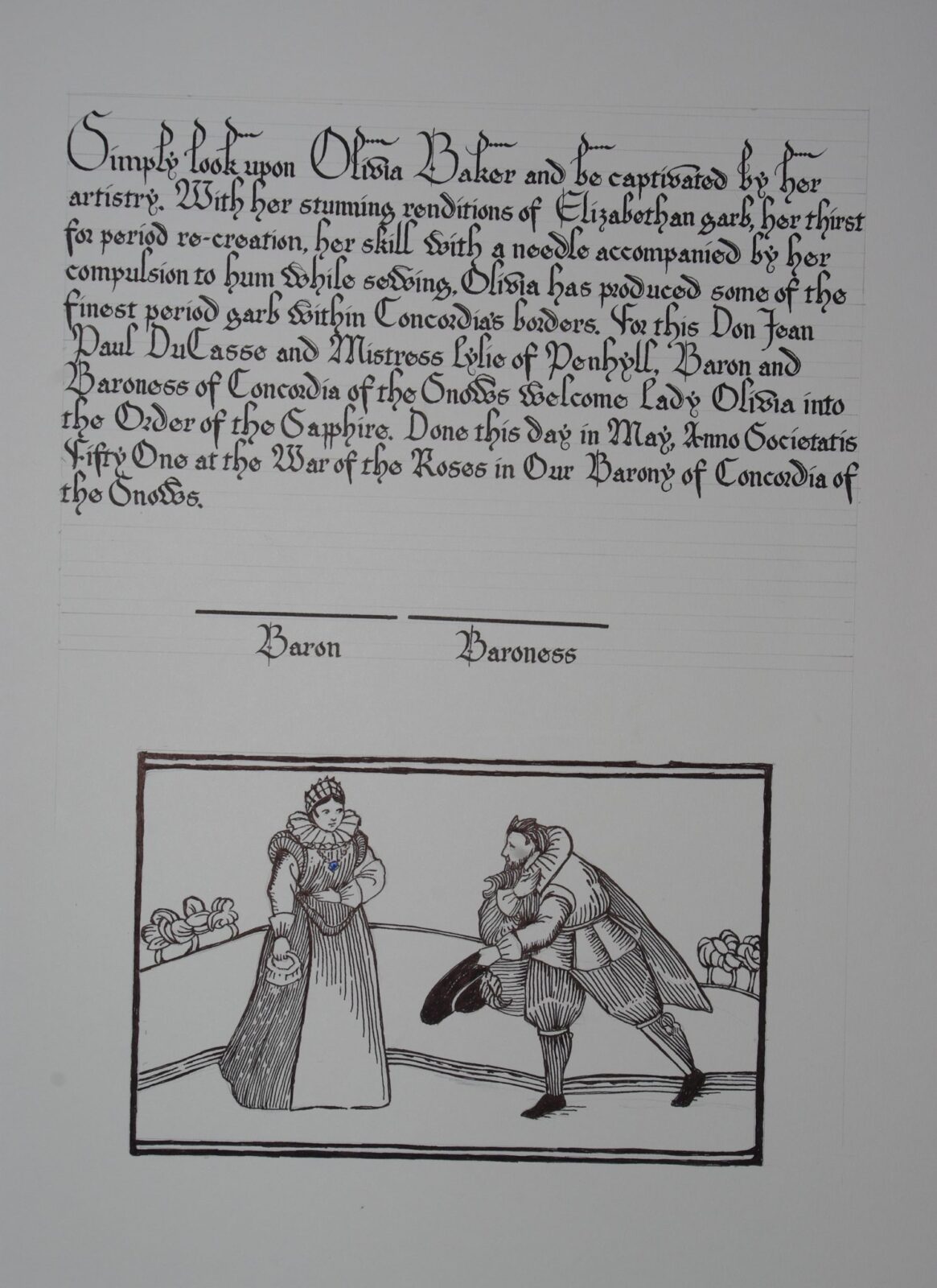
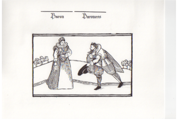
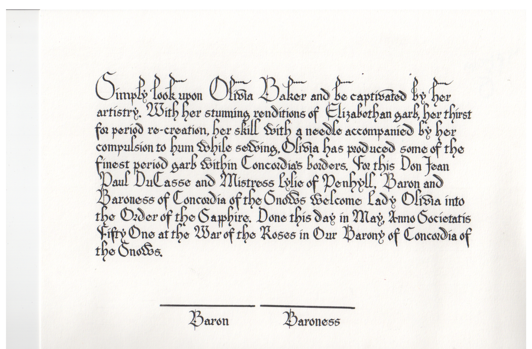
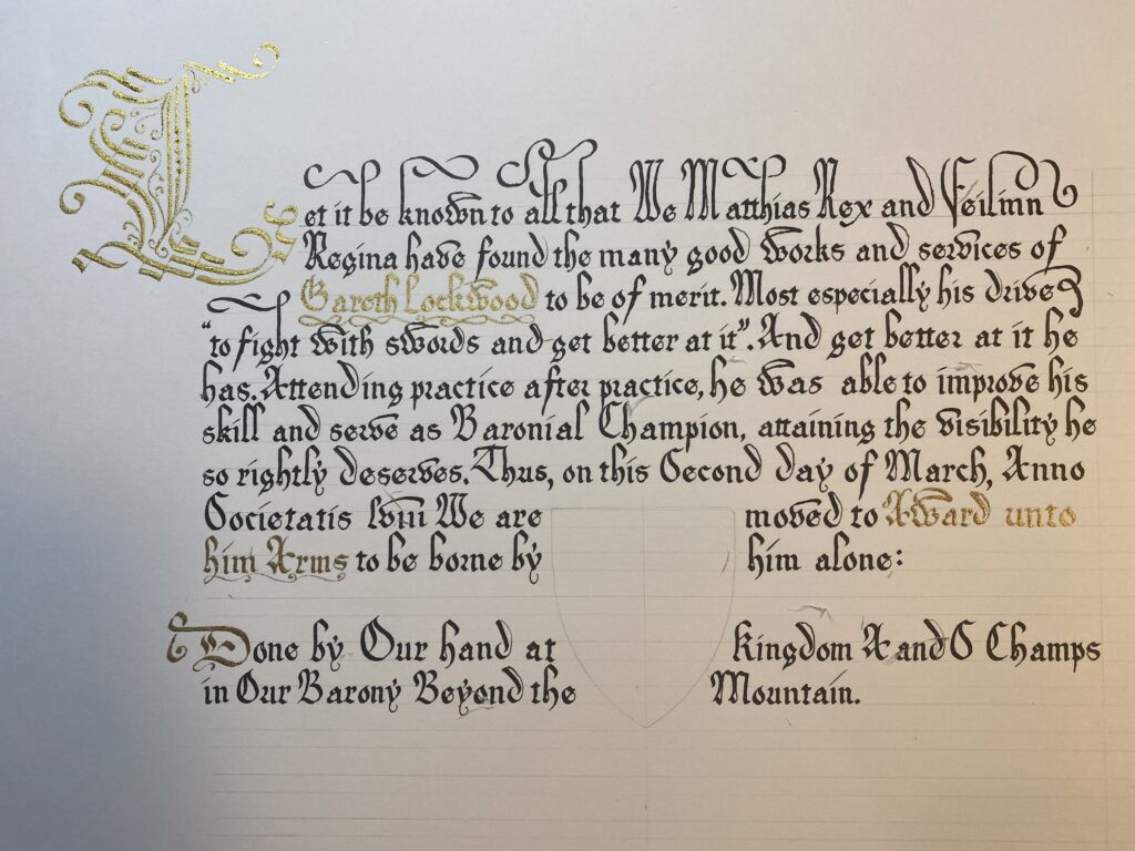
For this years War of the Roses (Go York!) I had the pleasure of working with Lady Elisabeth Greenleaf.  Elisabeth did a “woodcut” style from 16th Century England.  I chose to accompany it with Littera Bastarda (Bastard Secretary), 13th Century and onward.  Elisabeth was able to get words to me with measurements of my working area to me ahead of time, which helped greatly while I waited for the scroll itself to arrive.  I was able to get in a rough before starting on the final.

Olivia Baker - Order of the Sapphire - Top - Low

I had a lot of fun with the exaggerated capitals and the upward flourishes!  I still can’t believe how nice they look.  I used two exemplars for my script, The Art of Calligraphy by David Harris, and Medieval Calligraphy: Its History and Technique by Mark Drogin.

Olivia Baker - Order of the Sapphire - Bottom - Low

The draft took me about 4 hours and was rushed, sloppy, and wide spaced.  I do this so I have a good idea as to the absolute minimum space I’m going to need on the final scroll.  The scroll itself took about 6 hours.  It was done with a 1mm Tape nib and DeAtramentis Document black ink.  I wanted the hairlines to really work, so I played with sharpening my nib before I got started on the final.  The only downside of this was the “f”s, the nib would catch on the paper, causing me to stop and back up slightly before completing the character.

Higher resolution images:

Olivia Baker - Order of the Sapphire - Top - HighOlivia Baker - Order of the Sapphire - Bottom - High

One Comment

  1. Comment from Cawendaw over at /r/Calligraphy

    Oh my FREAKING GOODNESS that is some legible, consistent Secretary. Excellent work! You have served your liege (or someone’s liege, I’m not sure how fealty works in Concordia) with great lealty! I hope the Baron and Baroness y-showre you with favoure!
    CC:
    I think the flourishes work well as you have them, actually. I can see the temptation to flourish one of the descenders, but I think it works better without it. I can’t think of a way to incorporate one of the diamond flourishes like you had on the top line, and if you did something like have a huge sweeping final stroke for the y it might distract from the signatures.
    I also think you had good instincts on where (and where not to) use diamond flourishes on the top line. I also like that only-barely-flourished opening serif on “by.” It’s a very restrained but elegant touch that I wasn’t expecting, and I think it works really well to pull the look of the top line together.
    Letter nitpicks!
    Since you said you used Drogin, I’m basing this on Drogin’s texts/ducti/etc., if you have historical sources that trump them, ignore what I’m about to say.
    It seems like there’s usually a bit more white space in the loop of the miniscule “d”? Looking at the Adam & Eve piece on p. 154, it is admittedly all over the place, with “god” in line 2 being very close to the form you’ve chosen, “wolde” right before it being about 50/50 where whitespace is concerned, and “Seid” in line 1 going in the diametrically opposite direction, being almost all loop and no bowl. But it seems like most of the looped d’s tend more towards 50/50, with pretty much even amounts of whitespace in the bowl and stem. Yours seem to be heavily weighted in favor of the bowl, and while having it somewhat lopsided is fine, I feel like the loop almost disappears in some places, e.g. “Concordia” in line 7. So I would tell you to open up the loop of the d…
    Except that, contradicting everything I just said, I actually really like the look of the d in “accompanied,” line 3, even though it has one of the thinnest loops. I think it’s probably because the stroke seems a lot surer and more fluid than the other examples. So I guess my main feedback is to work on the miniscule d a bit more, and go whichever direction you’re more comfortable with and darn the exemplars.
    Finally, your majuscule D seems to have much more Roman, semicircular proportions than the ones in Drogins exemplars and ductus, which seem much more triangular, with a slightly more pointed top.
    As for layout, I think the work you put into it really shows. It’s very easy to read (no small feat with Secretary), and you’ve avoided ascender/descender collisions with great aplomb. I also really like the exaggerated ascender/majuscule height in the first line, in the grand tradition of the Adam and Eve piece from Drogin.

    One of the reviews that made this piece worth it.

Leave a Reply

This site uses Akismet to reduce spam. Learn how your comment data is processed.